MOMO
mochi donut cafe
Case
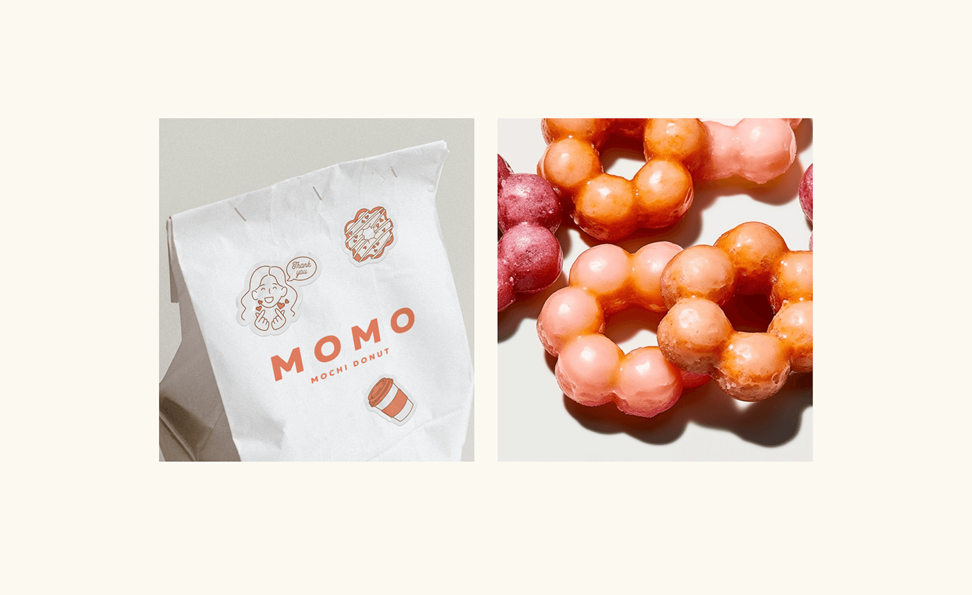
MOMO is a unique cafe in the center of Berlin, Germany, with a focus on cooking authentic Japanese mochi donuts, also known as Pont de ring. A special feature of these doughnuts are eight balls of dough that organically combine in the shape of a flower when unfolded. The name "MOMO" is inspired by a Japanese image that translates as "peach blossom".
The cafe's philosophy is built around the value of high quality, handmade and community support. They create not just a place for a pleasant pastime, but also a platform for communication between people who share their principles.
Solution
Japanese Pont De Ring doughnut cafe's design concept is inspired by minimalistic Asian aesthetics, blending charming illustrative characters with a clean typeface in a pleasing coral shade that evokes the aroma of freshly toasted doughnuts. The goal is to create an inviting and memorable atmosphere, aligning with commitment to a delightful customer experience. Beyond aesthetics, the design ensures easy readability and stimulates positive sensory responses, forging a strong connection between visual identity and unique offerings. This simplicity and memorability aim to leave a lasting impression, encouraging repeat visits and positive recommendations. In essence, design is a strategic fusion of aesthetics and functionality, enhancing the overall success of cafe.
Scope of work: Branding, Visual identity
Instagram: @imstaysi.design | Work with me: imstaysi.design@gmail.com